Published Oct. 6, 2026
Most engineering teams maintain an infrastructure dashboard that nobody looks at. It typically begins with good intentions: after an outage or migration, someone builds a wall of charts. Within weeks, however, the graphs become visual noise. Gauges drift out of date, metrics lack operational context, and engineers revert to running top or df -h in terminal windows.
A poorly designed server monitoring dashboard fails because it displays uncurated data instead of guiding decisions. During an incident, responders do not need fifty uncalibrated charts. They need immediate answers to three questions:
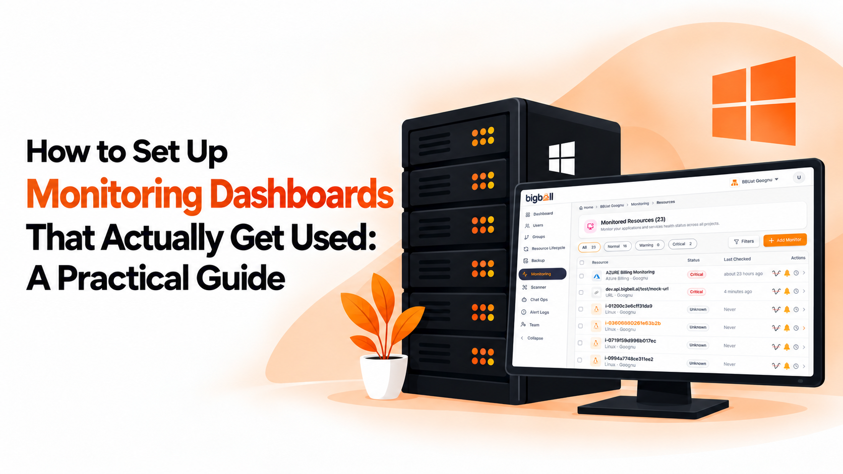
Building a server monitoring dashboard that teams actively use requires designing focused interfaces that streamline health checks and accelerate triage. If you have explored setting up free server monitoring tools, the next step is creating visual layouts that remain genuinely useful under pressure.
Telemetry tools only deliver value when actively integrated into daily workflows. An intuitive server monitoring dashboard provides decisive operational advantages:
Building a server monitoring dashboard that maintains lasting operational value involves five structured steps:
Avoid crowding every metric onto one screen. Place top-level health indicators at the summit, primary telemetry cards in the center, and detailed process or inode tables in dedicated drill-down views.
Focus your dashboard on essential host vitals:
Ensure engineers can switch between operational timeframes effortlessly: 24-hour views for recent deployments, 7-day and 30-day views for baseline forecasting, and custom datetime pickers for isolating specific incident windows.
Render warning and critical threshold baselines directly over time-series charts. Graph overlays give spikes immediate operational meaning, showing whether an elevation is an ordinary fluctuation or an actionable breach.
Link your dashboard views directly to incident notifications in Slack or Teams. This real-time visibility also ensures that periodic server monitoring reports reflect validated baselines.
Even experienced teams make architectural mistakes that cause dashboards to fall into disuse:
While building custom visualization stacks in open-source tools requires configuring complex queries and maintaining fragile UI schemas, BigBell.ai delivers purpose-built infrastructure dashboards designed for real-world operations.
Through BigBell Monitoring, BigBell eliminates dashboard maintenance overhead with automated Linux server monitoring:
psutil and requests), or deploy the centralized BigBell Bridge for automated fleet discovery and updates.A server monitoring dashboard is a visual interface that consolidates real-time and historical operating system telemetry—such as CPU utilization, memory allocation, disk storage, and active processes. It allows system administrators and DevOps engineers to assess host health, diagnose bottlenecks, and resolve incidents rapidly without running manual terminal commands.
Teams stop using dashboards when they become cluttered with irrelevant telemetry, lack flexible date filtering, or omit clear threshold boundaries. When a dashboard resembles a noisy wall of charts without actionable context, engineers abandon it in favor of manual terminal commands like top and df -h.
The foundational metrics for any Linux server dashboard include:
Timeframe filtering allows responders to compare live telemetry against historical baselines. By toggling between 24-hour, 7-day, and 30-day views, engineers can instantly determine whether high CPU or memory consumption is a sudden anomaly from a recent release or an expected scheduled workload.
BigBell provides dedicated server detail pages that organize performance telemetry into clean metric cards for CPU, memory, and disk health. Each card features historical trend charts, custom threshold lines, and quick timeframe toggles (24 hours, 7 days, 30 days, or custom datetime ranges), providing instant operational visibility without manual query building.
Visual threshold lines establish clear operational boundaries directly on time-series charts. When engineers observe metric trends steadily approaching warning or critical baselines, they can intervene proactively—such as scaling memory or clearing caches—well before an automatic threshold breach disrupts production services.